
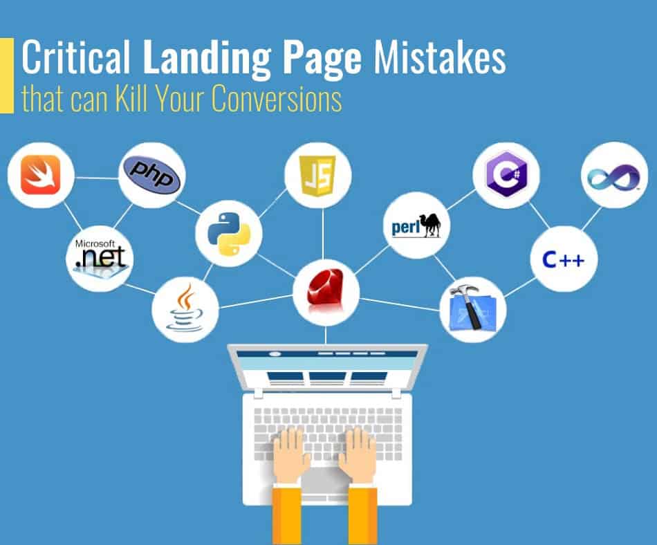
If you’re a marketer, then chances are you have heard of landing pages. They are the first page visitors see when they land on your website, and it is where most people will decide whether or not to convert into paying customers. Landing pages are different from home pages in many ways: they don’t contain much content; they usually only include one call-to-action; they often require users to sign up for an account before accessing them.
But are they even necessary? Well, yes! If done correctly, landing pages can effectively increase conversion rates by up to 300%. However, despite their simplicity, if misused, they could decrease them instead. So what do we mean by “critical mistakes” in this article? We’ll explain.
Critical mistakes are those things that make a difference between success and failure for any business. In other words, these are the things that can either help or hinder your ability to get more sales from your site. And as with everything else, marketers make some common mistakes with landing pages that could be killing their conversion rates. In this article, we’ve listed 11 critical mistakes you need to avoid at all costs. Let’s take a look now!
1) Not having clear goals

The primary purpose of every landing page should always be to drive traffic back to your homepage so that you can capture leads. But how exactly does that work? The answer lies within two key factors – Conversion Rate Optimisation and Call To Action. Conversion rate optimization refers to the process of making sure that each element on your landing page has been designed specifically to encourage someone to click through to another part of your site. This means ensuring that your headline grabs attention, your CTA button stands out, and that your form fields are easy to fill in. It also involves testing various elements until you find something that works best for your audience.
Call to action buttons are vital because no visitor would ever know what to do next without them. An excellent example of a well-thought-out CTAs is Amazon’s Buy Now button. When clicked, it takes visitors straight away to the checkout section of the online store. Without such a simple yet powerful tool, Amazon wouldn’t sell nearly as many products as they do today. Many businesses use popups to create calls to action, but these tend to annoy visitors and cause bounce rates to skyrocket. Instead, opt for a clean and discreet CTA button like the ones above.
2) Using too many forms

Forms are great tools for collecting information about potential clients. After all, who doesn’t love filling out surveys? They come with many benefits, including helping companies understand their target audiences better, improving customer service, and increasing brand awareness. For customers, filling forms gives them time to think over their answers and allows them to ask questions while giving feedback. All of this helps improve the user experience. While forms might be advantageous, they could also be detrimental to your website’s performance.
Unfortunately, using multiple forms on a single landing page makes it difficult for visitors to navigate around your site. As a result, they may end up leaving without completing anything. Plus, they might feel confused and frustrated since they won’t know what to expect once they reach the final step. Therefore, try to keep your forms to just three per page. That said, if you want to collect lots of data, consider creating several separate landing pages rather than trying to cram too much onto one page. You could also split off different sections into individual landing pages. For instance, you could have a lead generation page, then a product demo page, followed by a customer service page.
3) Not having an exit-intent trigger
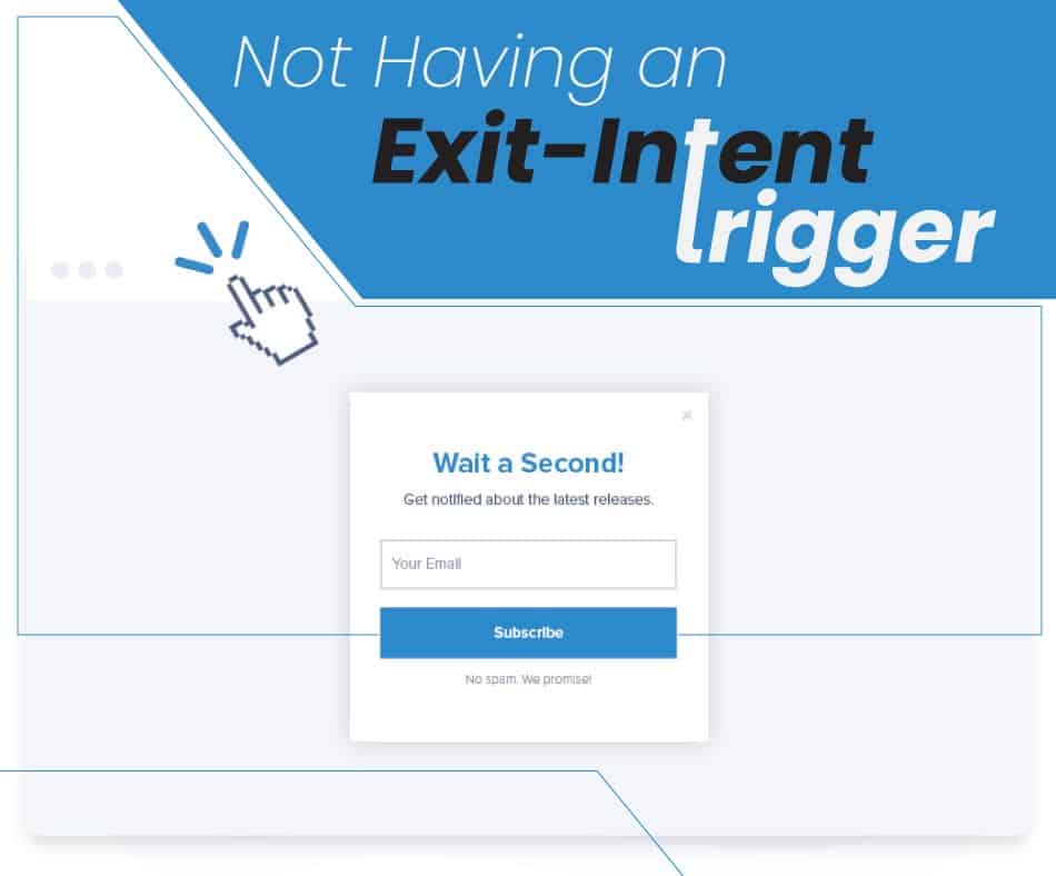
Ideally, when people land on your landing page, they will immediately start doing whatever task you need them to complete. In other words, they should leave your page only after clicking on a call-to-action. However, not everyone clicks on links or fills out forms right away. Some prefer reading content first before deciding whether or not to take any further action. Others don’t care at all about what happens next. If you haven’t already done so, ensure that your landing page includes some “exit intent trigger” that encourages users to move forward.
Exit Intent triggers allow users to leave your web pages immediately after clicking on any link or image. These are especially useful when people visit your site via search engines. If they land on a page with insufficient content or relevant information, they will move on to other sites. However, if they see a call-to-action button, they will most likely stay put. In fact, studies show that more than 50% of clicks happen due to exit intent triggers. An obvious way to achieve this goal is by adding a countdown timer. Another option is to include a link that says ‘Next Step:.’ Both options help ensure that visitors stay engaged throughout the entire journey. So make sure that whenever possible, you include at least one clear exit trigger. Ideally, you should place it somewhere near the top right corner of your webpage. Also, don’t forget to add some text explaining why your visitors need to take immediate action.
4) Using popups instead of modals
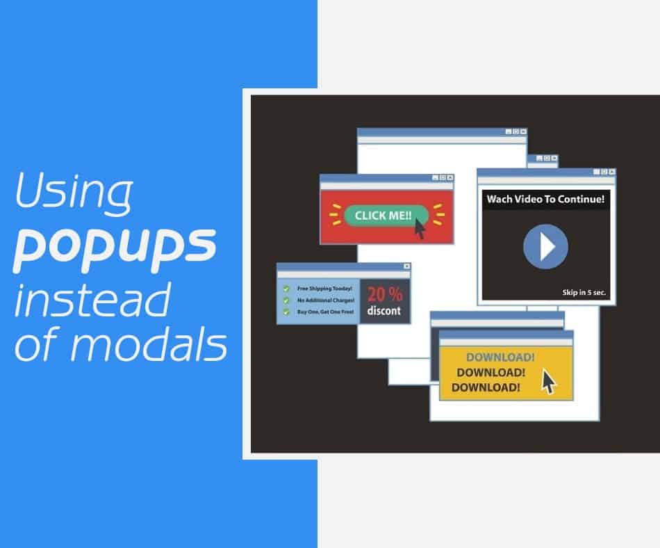
Popup windows aren’t as popular anymore because they tend to annoy many users. They take control of the browser window and prevent users from accessing other websites in the background. This means that they often cause slow loading times, poor usability, and even security issues. Moreover, to visitors, popups often look like annoying ads, which turn them off ultimately.
To avoid these problems, use modal windows. Modals work well when you want to give visitors additional information but still let them continue browsing. This is particularly helpful when you offer free trials or sign-ups. When someone lands on such a page, they will notice a small box asking him/her to fill out his details. Once completed, the visitor gets redirected back to the main page. The process seems seamless and easy to follow. Besides, unlike popup windows, modals do not block access to other websites. Instead, they appear over the current website while allowing users to interact with it usually.
5) Not having an opt-in email form
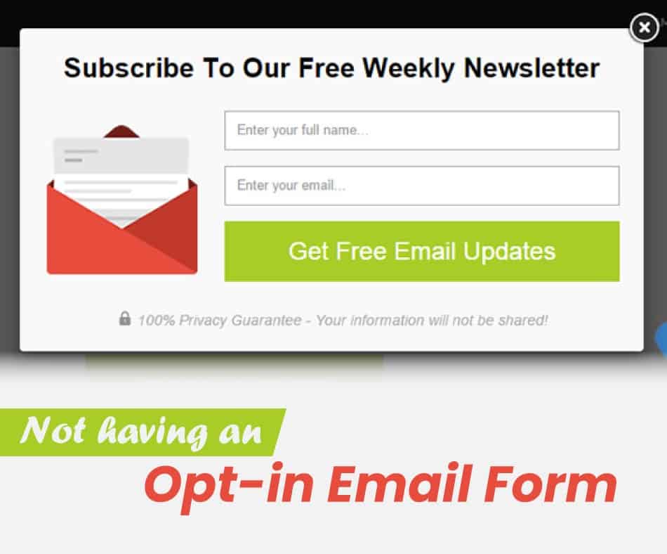
If you have ever tried running inbound marketing for your site, you know how important it is for businesses to collect emails. After all, every time someone signs up for something, they become part of your mailing list. And once you get their contact info, you can send them regular newsletters, promotions, offers, etc., without worrying about losing customers. You could also create special deals just for those who subscribe to your newsletter.
To be honest, collecting emails doesn’t require much effort. You need to create a simple form. Then, ask potential subscribers to enter their name, email address, phone number, company name, job title, location, etc. Make sure that everything looks professional and clean. Don’t worry too much about making things complicated. Just keep it short and sweet.
6) Having no social media buttons
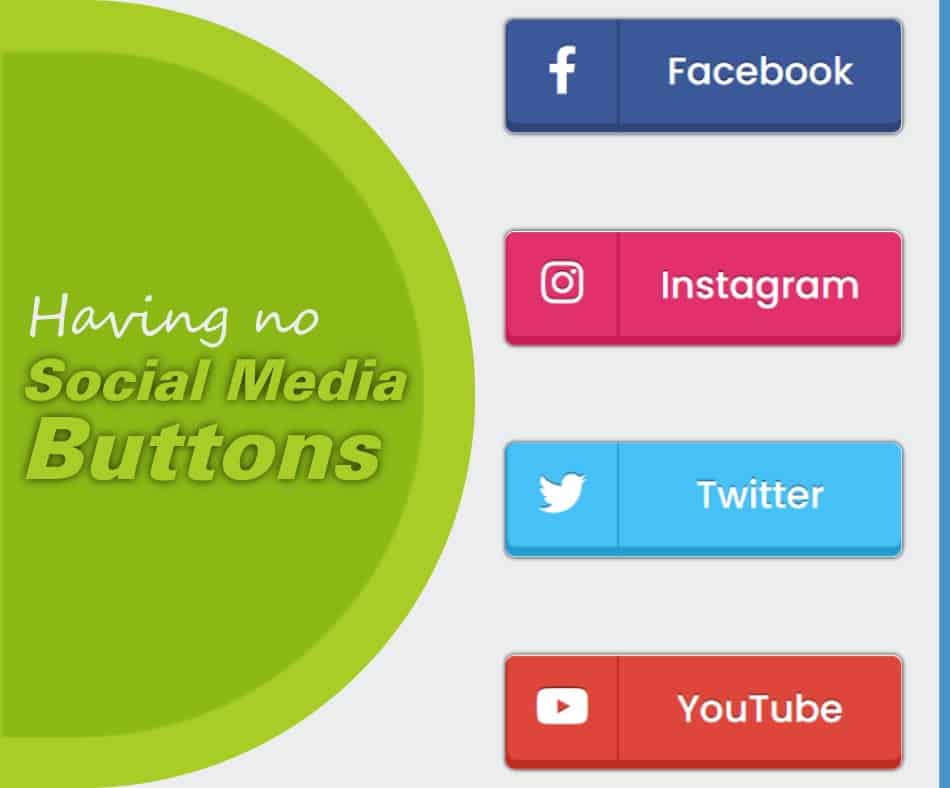
Social networks play a huge role nowadays. They provide marketers with tons of opportunities to promote products and services. More specifically, Facebook has become the world’s largest network. It boasts 1.79 billion monthly active users around the globe. That makes it almost impossible for companies to ignore its importance. Social media allows companies to run contests, share videos, post blog posts, etc. It has become so common now that almost everyone uses it. As a result, you shouldn’t ignore its importance.
To increase engagement rates, try including links to various social profiles on your landing page. By placing links to your landing pages on multiple platforms, you increase traffic to your website. Plus, you can easily share posts directly from within your blog dashboard. That way, visitors won’t feel lost and confused. Plus, they might end up sharing your pages with friends and family members.
7) Having unclear navigation
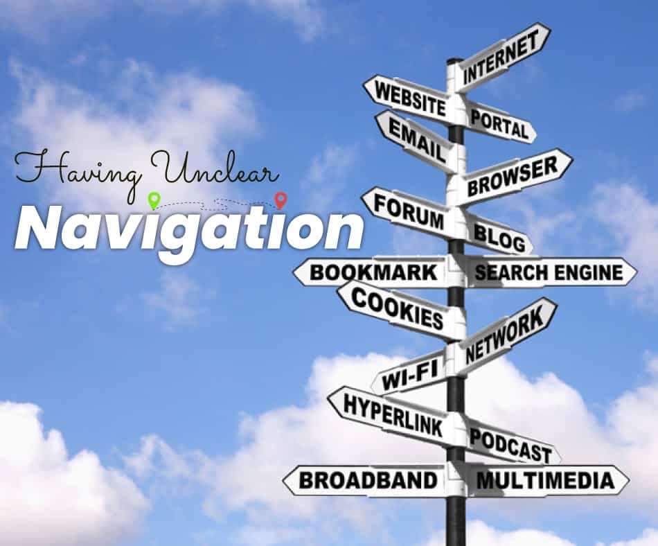
Navigation plays a crucial role in any web design project. If people don’t understand what they are supposed to click next, they may leave immediately. To make matters worse, if there isn’t enough content, they may never find anything interesting at all. In addition, poorly designed navigations lead to low conversion rates.
Make sure that everything is clearly labeled and organized. Otherwise, visitors might get lost and never find their way back home again! To make matters worse, some people may even click through multiple tabs before finding what they are looking for. If this happens, the chances are high that they will leave your site immediately. So, don’t take any risks. Keep everything as clear and concise as possible. It’s recommendable that before starting any new project, always test different designs until you come across one that works best.
8) Using generic images

Images are compelling tools when it comes to promoting websites or blogs. However, not many people realize that using generic images can hurt your business instead of helping it. For example, most people use stock photos because they look good but aren’t unique. This means that they lack personality and creativity. On top of that, these pictures tend to appear everywhere – on other sites, forums,
comment sections, etc. Therefore, they usually fail to grab attention. Instead, they only serve as distractions. And since we live in an era where distraction is king, they often cause more harm than good. If you must use them, then do so sparingly. Use them only once per article or video. Also, avoid using them in headers, footers, sidebars, ads, etc. Because after all, those areas should contain relevant information. Not random images.
9) Making irrelevant calls-to-action

A call-to-action button is something that encourages someone to perform specific actions. These buttons include things like “Buy Now,” “Sign Up,” “Download App,” etc. The primary purpose behind having such buttons is to encourage customers to complete specific tasks. Buttons also help businesses gain visibility by increasing brand awareness. Unfortunately, too many times, I see companies place unnecessary CTA buttons on their landing pages. Why? Well, simply put: they want to sell stuff. They have no interest whatsoever in building relationships with potential clients. As a result, the majority of visitors ignore them completely. This leads us to our next point…
10) Lack of personalization

Personalized content on landing pages works better than generic ones. People respond much faster when they see personalized content compared to standard ones. Moreover, they are less likely to exit. That’s why it’s essential to keep track of user behavior and preferences.
You need to know which parts of your landing page users prefer over others. Then, create custom versions of each part based on their interests. Personalized content tends to be much more effective than plain text in things like testimonials, social media links, special offers, etc. It helps build trust between you and your audience. Plus, it makes users feel valued. In fact, according to research conducted by HubSpot, 80% of consumers say that seeing a company name on a landing page increases their likelihood of buying from that particular store.
11) Poor page load time
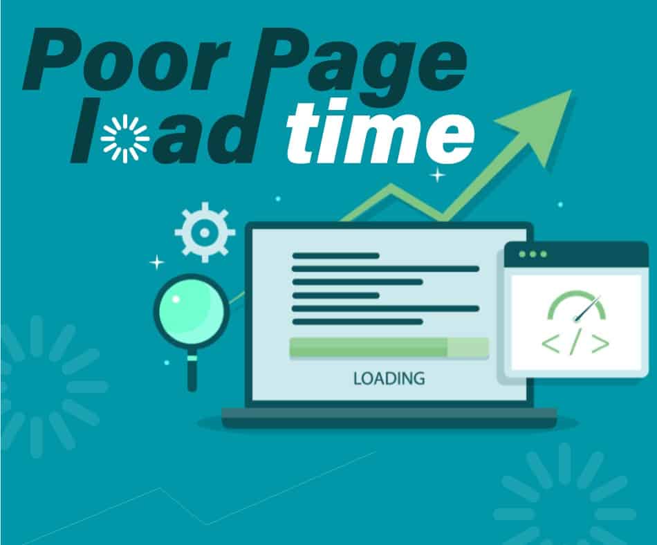
Page speed has become increasingly important over recent years. Google now ranks web pages according to how fast they load. A slow-loading website won’t rank well either. According to research conducted by Moz, there was a significant increase in mobile searches between 2014 and 2015. During that same period, desktop search queries dropped significantly. What does this mean? Simply put: people are searching online via smartphones and tablets more frequently than ever before.
And if your landing page takes longer than 3 seconds to load, it could cost you dearly. So make sure that everything loads quickly. Start with basic optimizations like reducing file sizes, removing unused CSS/JS files, optimizing images, etc. Once you get comfortable doing that, move on to advanced techniques like GZIP compression, HTTP2 push, CDN integration, etc. There are plenty of resources available for free on the internet. All you need to do is find out what will work best for your site. After all, you don’t want to spend money unnecessarily.
Conclusion
Landing pages are susceptible to changes. That’s why it’s essential to keep track of every single detail about each visitor. After all, who knows how long they have been visiting your website? What was his previous experience? How did he arrive at your page? Did he read somewhere else first? All of these questions matter. You need to know exactly which details are going to influence them the most. Then, you need to adjust accordingly. Don’t forget to add personalized elements to your landing pages. And yes, let the page take the least time possible to load.
